Websites Are Places, Too: Layout Basics

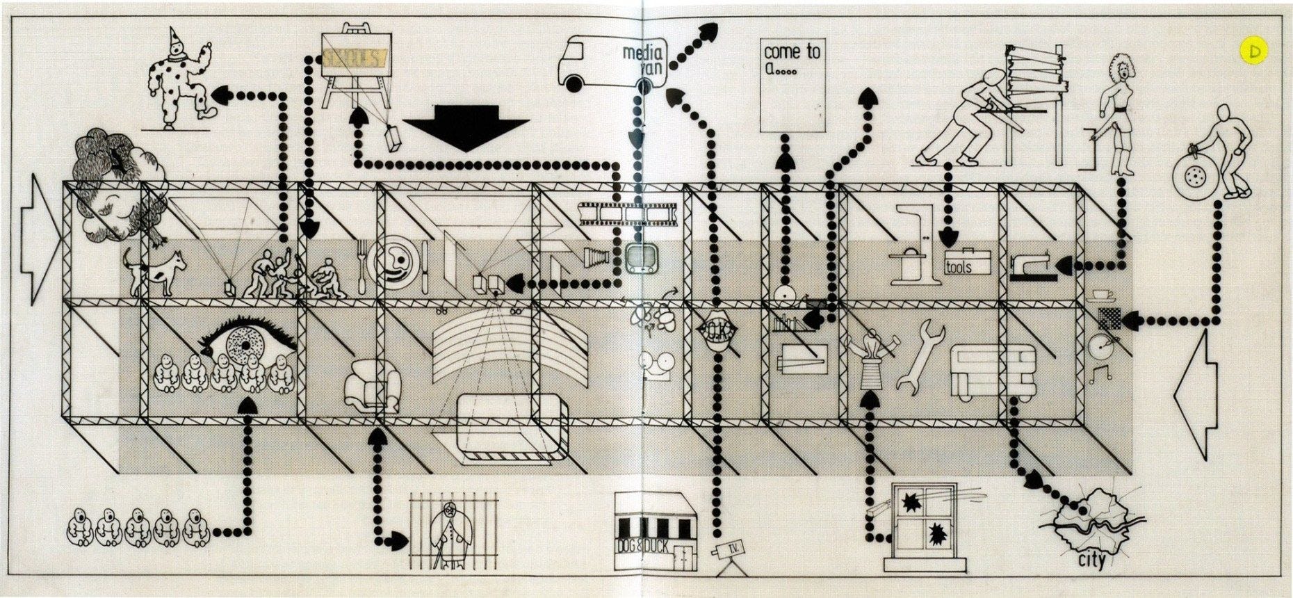
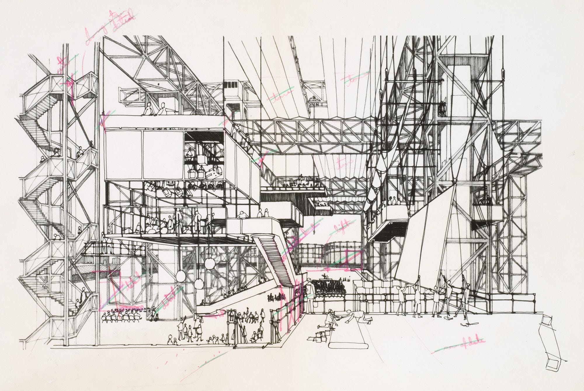
Cedric Price was a visionary architect. He incorporated cybernetic feedback loops in projects that challenged traditional relationships between architects, users, sites, and technology. The Fun Palace (1963–1967, unbuilt) one of his most influential projects, designed with theater director Joan Littlewood and cybernetician Gordon Pask, challenged the very definition of architecture. The Fun Palace was not a conventional ‘building’, but a kind of scaffold or framework, enclosing a socially interactive machine — a virtual architecture merging art and technology.
In this lesson, we are going to think about the layout as a framework hosted within the web browser. This lesson provides one of the tools to experiment with what that framework can look like. Is it a building? Is it a room? Is it a park or a playground? This supporting framework can then be used to facilitate interaction between people (users) and the computer (web browser).
Layout History
- A Brief History in Layout Design: The Early Grid Systemsby Natalie Boyd. Print. December 4, 2016
- Page Layout, Wikipedia
Normal Flow
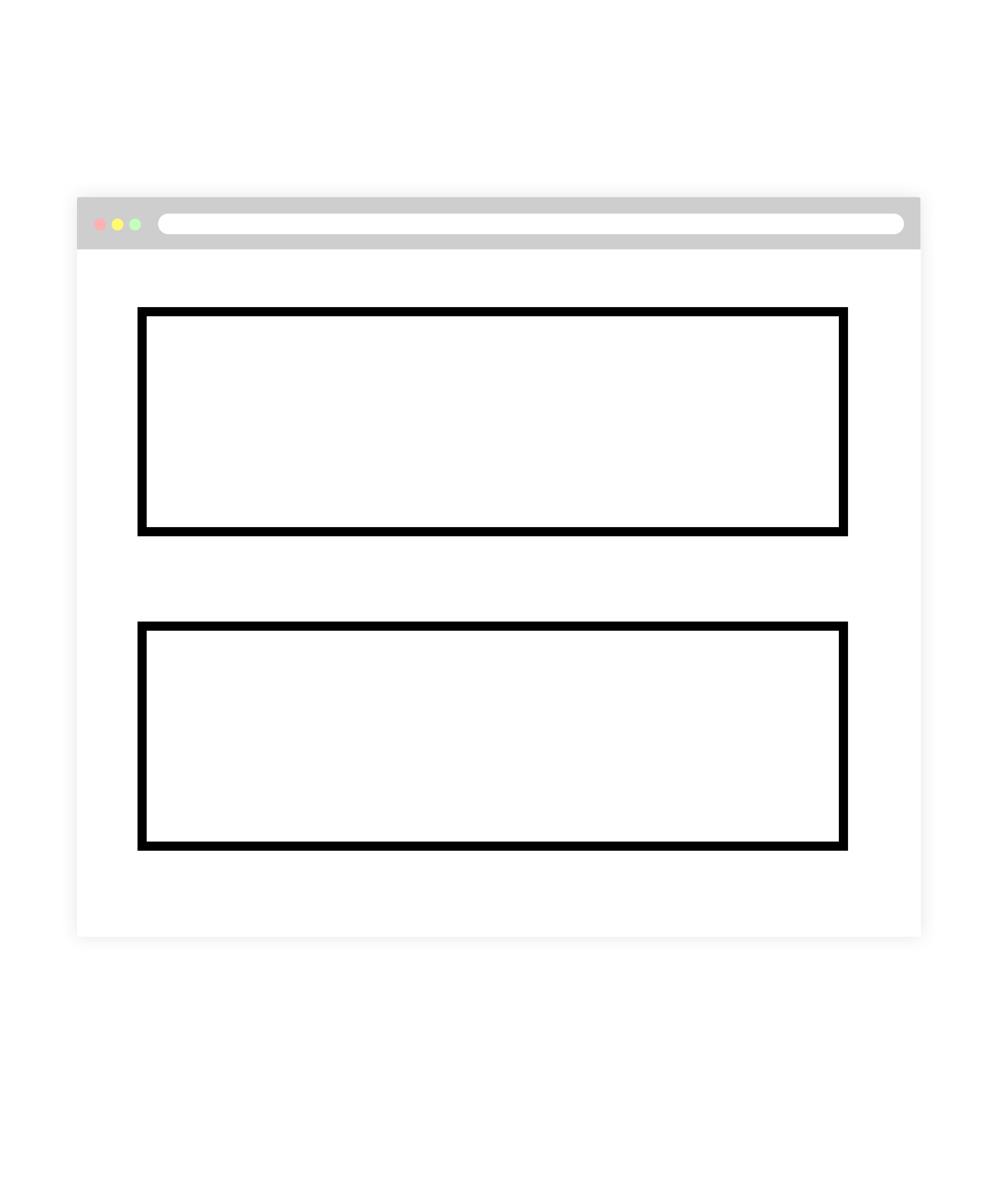
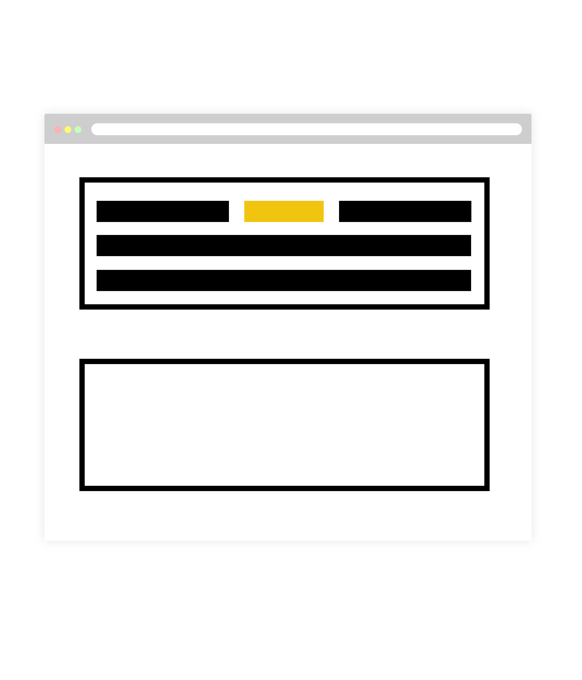
Normal flow is where you begin with any layout. In the normal flow, text elements are laid out from top to bottom, and from left to right in left-to-right reading languages (or from right to left in right-to-left reading languages). This is the default behavior of the web browser.
In the normal flow, block-level elements stack on top of one another and inline elements fill the available space.
- CSS Flow Layout, MDN Documentation
- Getting Started with CSS Layoutby Rachel Andrew. Smashing Magazine. May 25, 2018
Display
In Virtual Poetry: HTML Basics, we discovered that every element on a web page is a rectangular box. Even if you see a circle, it lives within a box. This box can be a block-level or an inline box. The display property in CSS determines exactly how that rectangular box behaves.
A block-level element has some whitespace above and below it and does not tolerate any HTML elements next to it. This makes the element a block box. It won’t let anything sit next to it on the page and takes up the full width of the browser.
                    div {
                        display: block;
                    }

An inline element has no line break before or after it. This makes the element sit on the same line as another element, but without formatting it like a block. It only takes up as much width as it needs . Inline places all your elements on a single line. The bad news is that it doesn’t maintain its “box”ness.
                        div {
                            display: inline;
                        }

An inline-block element is placed as an inline element (on the same line as adjacent content), but it behaves as a block element. This makes the element a block box but will allow other elements to sit next to it on the same line.
                        div {
                            display: inline-block;
                        }
If you assign none as the value of the display, this will make the element and its content disappear from the page entirely!
                        div {
                            display: none;
                        }
Floats
The concept of “floats” comes from print layouts, where text wraps around an image on either left or right. The image element is removed from the normal flow of the web page, placing the element to the left or right side of its container, while allowing other elements to wrap around it. Floats were never meant for digital layout and have been superseded by Flexbox and CSS grid.
Positioning
In CSS positioning, blocks are defined as being either in the normal flow or removed from the normal flow. It’s a way to build complexity into your page layout. Floating and positioning elements allow you to change their relationship to the normal flow.
Static Positioning
The default value of every element is static. A static object receives its layout rules from properties such as display and float, and is considered an ‘un-positioned’ element. Any element that has a value other than static is referred to as a ‘positioned’ element.
You rarely explicitly declare `position:static` like this because it is the default.
Relative Positioning
Using `position: relative` allows you to position an element within the document flow in relation to where it would normally occur. For example, let’s place two divs on our page and view them in their natural document flow:
Absolute Positioning
Specifying `position: absolute` _removes the element from the document_ and places it exactly where you tell it to be.
An element that has been styled with `position: absolute` will remove that element from the rest of the document flow, and position it in relation to the closest positioned element. If there are no other positioned elements on the page, the absolute element will use the
as a reference object.Because `position: absolute` elements work in tandem with other positioned elements, you must set the reference element to `position: relative`. Let’s look at an example.
Fixed Positioning
A fixed element is not only removed from the document flow, but also stays in its position as the user scrolls on the page. A common fixed element is the nav. Let’s see it in action. Here’s the nav in its natural flow of the document:
Tutorial 3.1
Cedric Price’s Fun Palace was an environment continuously interacting and responding to people. For this tutorial, we are going to lay the groundwork for a PLACE where the public could have agency over their environment. The resulting PLACE could be responsive to visitors needs and the many activities intended to take place there.

Instructions
Using CSS float, positioning and the box model (margin, padding, border), create a PLACE where you can perform a specific activity — either for you to do or observe someone else doing.
Play with other CSS properties such as z-index, background color, border, shadow, and gradient.
Flexbox
CSS Grid
Tutorial 3.2
Instructions
Create three more PLACES (using one of the architectures above) and **create a way to navigate between them **(dérive — a technique of rapid passage through varied ambiences). An alternative to this tutorial could be to create a single-page PLACE and use anchor tags to navigate between them.
Responsive Design
“Responsive Design” is the strategy of making a site that “responds” to the browser and device that it is being shown on… by looking awesome no matter what.
Exercise 3
“We lost public spaces. Online public spaces. Facebook and Google are shopping malls, but we think they are parks!”
Make sure that all the PLACES are responsive (including your navigation system) and that the visitor is still able to use the site to perform the intended activity.